If your early web designs don’t take accessibility into account, there’ll only be so much you can do at the implementation stage. Focus on these four design areas to create a solid base for your accessible website.
Too often, accessibility is an afterthought when it comes to web design. Which doesn’t make sense when you consider that design is all about making things easy for people to use.
In my last post, I looked at how accessibility should be a consideration for the whole development team. In this post, I’ll be looking at four critical areas that concern designers specifically.
1. Colours
The first is colour. Not everyone sees colour the same way and not every display will render colours with the same quality. For colourblind people, it can be extremely hard to distinguish between certain colours.
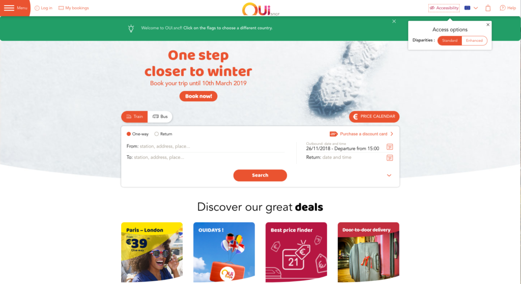
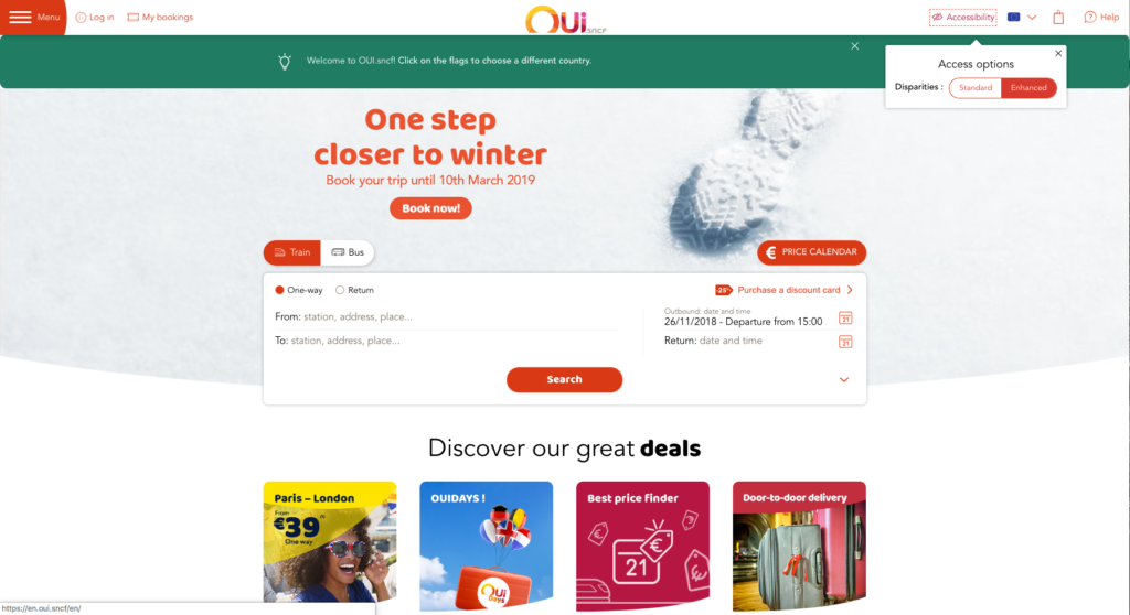
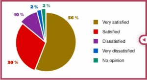
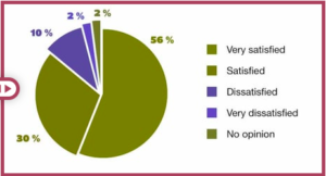
With that in mind, using only colour to distinguish between information onscreen is a poor road to take. As these charts from Atalan show, some users may miss out on or misinterpret information.
That’s why it’s best to complement different colours with another visual cue.
Another example is the default styling of links. The added underline ensures users realise the link text is different from the standard text. Underlines are not the only option though – backgrounds, borders, dots, icons can all be used to differentiate copy from its surroundings.
To help users notice these elements, you’ll still need to pay attention to which colours you use. Without enough contrast, even users with good eyesight will end up missing information.
This doesn’t mean you have to make everything black on white, but you should ensure you have a good contrast ratio between foreground elements and background – at least 1:4.5 for regular size text to pass Web Content Accessibility Guidelines (WCAG) AA criteria.
If you’re unsure which colours of your palette contrast with which, use a colour matrix tool to highlight safe combinations.
And if your choice is limited – due to branding constraints for example – all is not lost. If accessibility wasn’t considered when initially picking the colours, see if your stakeholders are willing to update things and use an accessible palette for the product. It doesn’t hurt to ask.
If that fails, there may still be room to provide the option of switching to an accessible theme within the product.
2. Size and spacing
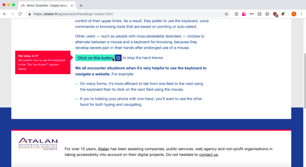
Another big accessibility factor is the size and spacing of the elements on the screen. Sure people can zoom (more on that in a moment), but only up to a point – and it’s better if they don’t have to.
The size of onscreen elements has two main impacts:
- It helps (or hinders) the way we consume content on the site. If the copy or images are too small, people won’t get the information they’re after. WCAG recommends that text should be resizable up to 200% without losing content or features – going much below the default font size of 16px is asking for readability issues.
- It ensures users can interact with interactive elements such as links and buttons more easily. WCAG recommends a minimum size of 44x44px for buttons.
Just as important as the size is the spacing between the elements. Balanced spacing is aesthetically pleasing, but it also plays a big part in helping people use your site. Decent spacing between sections helps break them down, providing a welcome pause for users and clear boundaries that make the page easier to understand.
Providing enough space between interactive elements helps your users avoid tapping or clicking on the wrong thing – all the more important if your user has a tremor or other motor impairment.
3. Responsiveness

It’s 2018, and the websites we produce at CookiesHQ are responsive by default. With so many devices available, and so many screen sizes, they have to be. But responsiveness isn’t just for the benefit of mobile phones and tablets. For partially-sighted users who need to zoom on the page, a fullscreen browser on an HD screen could end up with a viewport as narrow as on a mobile phone.
If you’re on a desktop, you can try zooming this very page with Ctrl++ and see how the menu will turn into a mobile menu. You can press Ctrl + 0 to restore the original zoom.
With more and more websites designed responsively, it’s great news for disabled users. But it’s important not to assume that, because a user is on a narrow viewport, they’re on a mobile and need different (or reduced) information. The user should still be able to access the entirety of the site’s features in that view.
4. Content and interactions

Last – but maybe first in the list of things to think about – is the content of the pages and the interactions around them.
If you’re thinking of providing text transcripts next to an audio recording, chances are you already know you’ll need extra space onscreen to display them.
But what about the textual description of data graphs – should this be hidden or can it benefit everyone through being placed on the page? And, for people who would benefit from autoplay videos having a pause button, where will the icon fit on the design?
Implementing accessible patterns retrospectively means the new elements have to fight for space on an already crowded screen. Better to account for that early on, rather than shoehorning them in during implementation.
Along with the position of everything on the screen, the interactions themselves should be considered with accessibility in mind.
Hovers and gestures provide handy shortcuts… for the people able to perform them. When they’re not essential to the feature (it’s tough to draw on a screen without a gesture, for example), they should remain just that – shortcuts. The app should also provide a path users can single tap, keyboard activate, or click through to get their results. And this has to be planned for at design stage.
Final thoughts
Hopefully, this has given you some helpful pointers that will help you make your next design more accessible. It should also help you identify shortcomings in designs that are presented to you.
Nailing every single thing accessibility-wise is one hell of a task. But if you pay close attention to one area after another, the accessibility will gradually improve and everyone will benefit.
Of course, design is just one stage in the production of a web product. In a future post, I’ll explore what developers can do to maintain accessibility through the coding stage.
Ready for more accessibility tips? Try:
- Building accessible websites is a job for the whole team
- How to implement an accessible front-end on your website
Need advice now? Contact us today for expert help with making your website accessible.
