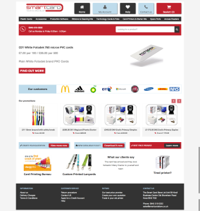
 We built the Smart Card Store online shop in just 6 weeks and launched it in January last year.
Due to unusual circumstances, the client couldn’t give us more time or budget (read the full story here) so user experience and design were a bit overlooked. Still, we produced and delivered a clean and professional interface, but knew that there was room for improvement.
Besides, their online shop brings in a substantial part of their revenue, so investing some time and money in UX and design is definitely worth it.
Who the client is
Smart Card are an ID specialist. They sell cards, card printers and accessories. It’s not what you could call a funky industry. Most of their clients are businesses and organisations, big brands like Mc Donald’s, Fiat, Microsoft and BT.
Their customers are not impulsive buyers. We are talking about businesses who plan their purchases and often buy in large quantities. They don’t need to be blown away by the design in itself. What is likely to make them come back is a straightforward, quick and secure purchase process.
The two things they really need is either go straight to the product they’re after, or contact our client for a quote.
Our solutions
Most of our work was done on the homepage, which we reviewed from top to bottom, focusing on 3 elements: the menu, the search box and product promotions. We’ve then applied the style and colours to the rest of the website.
Rethinking the top menu
In the 1st version of the site, the top menu displayed 3 ‘categories’: brands, product ranges and support.
Now the focus is on the product ranges. If a customer is looking for a particular brand, he will use the search box as there’s a good chance he knows exactly what he’s talking about. It is now easier for visitors to browse the various product ranges and sub-ranges and therefore easier for them to find what they’re looking for.
Making the search more prominent
As I already mentioned, for the Smart Card Store, the search box is essential. Customers often search for a particular product, product code or brand. So we made it bigger and more visible by putting in a large bold red container.
It’s obviously displayed on all pages of the site.
Adding product promotions
Research shows that displaying individual products on the homepage of an online shop increases conversion rates. So that’s what we did.
Now when visitors land on the homepage, they see immediately the type of products that are sold and they are encouraged to browse and have a closer look at particular products that our client wants to promote.
We’re not designers but…
We understand our clients and the web industry. We can all agree that, although this website now looks much better than it did previously, there is still room for improvement in terms of creative design.
However, by listening to our client and reviewing their existing marketing materials, we’ve found ways to improve their online shop.
Only time – and Google Analytics – will tell whether we made the right decisions.