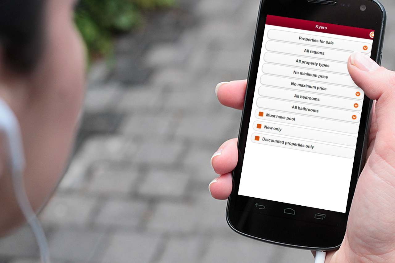
I recently had to develop a mobile version of Kyero.com, a Spanish selling and renting property website. The desktop website has been under active development for the past 6 years. It’s developed with Rails, and I had to plug my code around the existing one trying to minimise “new features == new files” impact. The whole mobile version was ready in around 5 days of development and we added 3 more days to polish the style and UX. Here is what I’ve learned.
The debate between responsive VS specific app
We obviously asked ourselves what the right choice was between them. Even if I’m a complete advocate of the responsive design, this time we decided to go for a separate mobile app. The reasons behind this choice were:
- Kyero.com is an existing website, with a lot of legacy CSS code and design elements, transforming this into a responsive version would have taken way more than 8 days.
- The Kyero.com team is currently seeing a spike in mobile traffic, but wasn’t sure if they were going to convert well in terms of enquiries. So we had to be pragmatic.
- Kyero.com is all about property search, which means a simple goal and process, but with potentially complex forms.
Do your homework
When developing a mobile app, it always helps to create initial on scale wireframes, so you can easily spot UX mistakes or overcrowded pages.
In fact I found that this step was one of the most important elements of the whole process.
Rails and jQuery mobile
I first started to use Mobile_Fu for the mobile detection, but I wasn’t very happy with the way the plugin was behaving so I finally chose to write my own mobile detection engine. It’s really trivial, you can checkout the Mobile device Railscast episode, which will talk you through the whole process.
I won’t write another guide on how to integrate jQuery Mobile with Rails, others have done it before me:
A multiple part article on EverydayRails
Another nice tutorial on MetaSkills.com
If you’re using Rails 3.1 and above, there is a jQuery mobile Gem on github, which I wasn’t able to use as I was working on a Rails 2 app 🙁
Mobile detection and Google site indexing
As I mentioned before, I’ve used my own detection method based on the User Agent. I’ve obviously extracted the user agents into an initializer and here is what they look like:
MOBILE_USER_AGENTS = 'palm|blackberry|nokia|phone|midp|mobi|symbian|chtml|ericsson|minimo|' +
'audiovox|motorola|samsung|telit|upg1|windows ce|ucweb|astel|plucker|' +
'x320|x240|j2me|sgh|portable|sprint|docomo|kddi|softbank|android|mmp|' +
'pdxgw|netfront|xiino|vodafone|portalmmm|sagem|mot-|sie-|ipod|up\\.b|' +
'webos|amoi|novarra|cdm|alcatel|pocket|ipad|iphone|mobileexplorer|' +
'mobile|googlebot-mobile'
You can see that the last User Agent available is google-mobile. This is because we’ve decided to use the HTTP Vary Header to notify Google that some pages were available for mobile.
I really recommend that you read the official Google recommendations to choose the best method that will suit your SEO needs:
Google Developers on Building smartphone optimised websites
Google introducing Googlebot-mobie
Google on making websites mobile friendly
Page caching
I had some issues with page caching and the back button at some points, which was easily fixed by adding the data-url attribute on the main page
#main{"data-role" => "page", 'data-url' => "#{request.path}", 'data-theme' => 'd'}Carousel
To display the properties images, we’ve used the Camera.js carousel.
Really easy to implement and a nice result.
The only problem I encountered was that, when browsing around, the carousel would display more images that it should have, because of jQuery mobile caching.
This was fixed by adding in a mobile.js file
$(document).bind( "pagebeforeload", function( event, data ){
  $('.camera_wrap').remove();
});
Customisation
In order to match the current Kyero.com website colour scheme, we needed some level of customisation.
I’ve created a mobile.scss file that would only be loaded in the mobile view, and used the Jquery Mobile theming idea, so where customisation was needed, I would add a data-theme=’kyero’ attribute.
Flashes
If caching, the flashes were sometimes not clearing themselves properly.
Adding a simple flash.discard after the flashes display fixed it.
%div{'data-role' =>"content" }
        - flash.each do |name, msg|
          = content_tag :div, msg, :id => "flash_#{name}", :class => "ui-body ui-body-e flash"
          - flash.discard
IOS select bug && Ajax calls
On the last IOS version, there is a bug on select tag focus.
This can easily be fixed in your mobile.js file by adding
$("select").live("focus", function () {
  $.mobile.zoom.disable(true);
});
$("select").live("blur", function () {
  $.mobile.zoom.enable(true);
});
I also sometimes needed to manually make some ajax calls that would inject select and other HTML elements into the code. This would result in a non jQuery mobile theme version of these elements.
Easy fix was to trigger the “pageCreate” jQuery Mobile event.
Like that
function update_location_select(location_id) {

  $.mobile.showPageLoadingMsg();

  $.get('url', function(data) {
    $('#location_selector').html(data);
    }).complete(function(){
      $("#main").trigger("pagecreate");
      $.mobile.hidePageLoadingMsg();
    });;
  }
Overall experience
It was a real pleasure to develop with jQuery Mobile, the documentation is pretty good, and I found the whole process enjoyable.
It allowed us to develop a mobile version in a very short period of time, and the client was happy, so really nothing to complain about.
Notes
At the moment, the code is not deployed on production (it should be done during July) because the team is busy launching a new app localeapp.com which I really encourage you look at if you’re dealing with locale files.
