Patternbank are the world’s largest online collection of textiles designers and have provided bespoke designs for renowned companies such as Nike, M&S and Paperchase. They’re home to some of the leading designers in the world and include handcrafted designs for use on everything from clothing to wallpaper.
We have partnered with Patternbank since 2014 and we’re proud of our combined achievements that have helped them become the global sensation they are today. Our latest collaboration with them aimed to improve on the current browsing and shopping experience for their users.
The improvements
In order to deploy a flawless, easy-to-use platform, there were a number of improvements to be made to the existing user experience.
Colour picker
Searching designs by colour was counterintuitive and difficult to locate. Users needed to navigate into a design and choose one of the 6 top colours that the system had extracted from that image. Colour is one of the most important aspects of a design so it was vital to give users the ability to filter designs by colour quickly and efficiently. As there are over 40,000 active designs on the Patternbank platform, we needed results to be accurate to return the most relevant colours for users. To achieve our goals, we implemented a HEX colour picker on the studio and use Elasticsearch to return designs matching (or close to) the chosen colour.
 Easy-to-navigate header menu
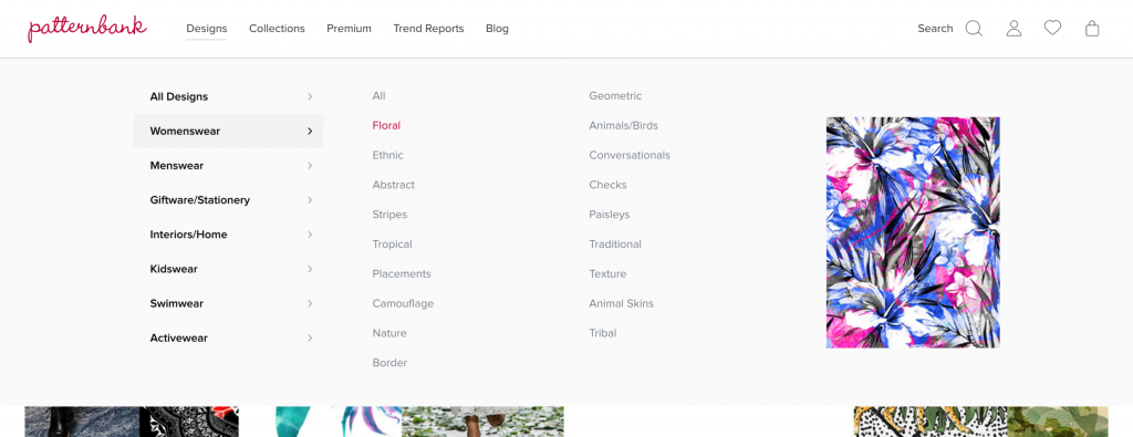
Another browsing pain point that needed improvement was the page depth users needed to navigate to find relevant designs. From the homepage, users could select to view all categories, chose from a list of categories and finally they would be on the studio. By implementing a large header menu, viewing all designs within a category now only takes 1 click.

Studio refactoring
The Patternbank library has over 40,000 designs available for users to browse which puts extreme pressure on the server to load them all on the studio. As our main objective was to allow users to find relevant and accurate designs as quickly and efficiently as possible, it was important to prevent slow studio loading times.
We refactored the shopping bag feature – legacy code meant that the more items the user had in their bag, the slower the site became when loading content. The shopping bag is prevalent on every page of Patternbank, so fixing this enabled users to add many designs to their bag without any impact on speed.
Another major improvement was switching from SQL queries to Elasticsearch. Instead of pinging the database every time we needed to load designs on the studio, using a dedicated search engine improved the website speed by over 2 seconds.
The Results
It’s no secret that as modern internet users, we want to find what we are looking for to be fast, easy and accurate. If a potential customer has to go through a minefield of filters, without successfully finding what they’re searching for, they’re less likely to complete a purchase or to return to the website at all.
When identifying the key features and building the new studio, we always went back to the original goal; allow users to find accurate and relevant designs as quickly as possible. We only released the new studio last week, so it’s too soon to know the impact it has on the overall user experience. What we do know is that the website speed has had a significant improvement and feedback has been extremely positive!
Header image by Markus Spiske on Unsplash