What onboarding isn’t
What onboarding is
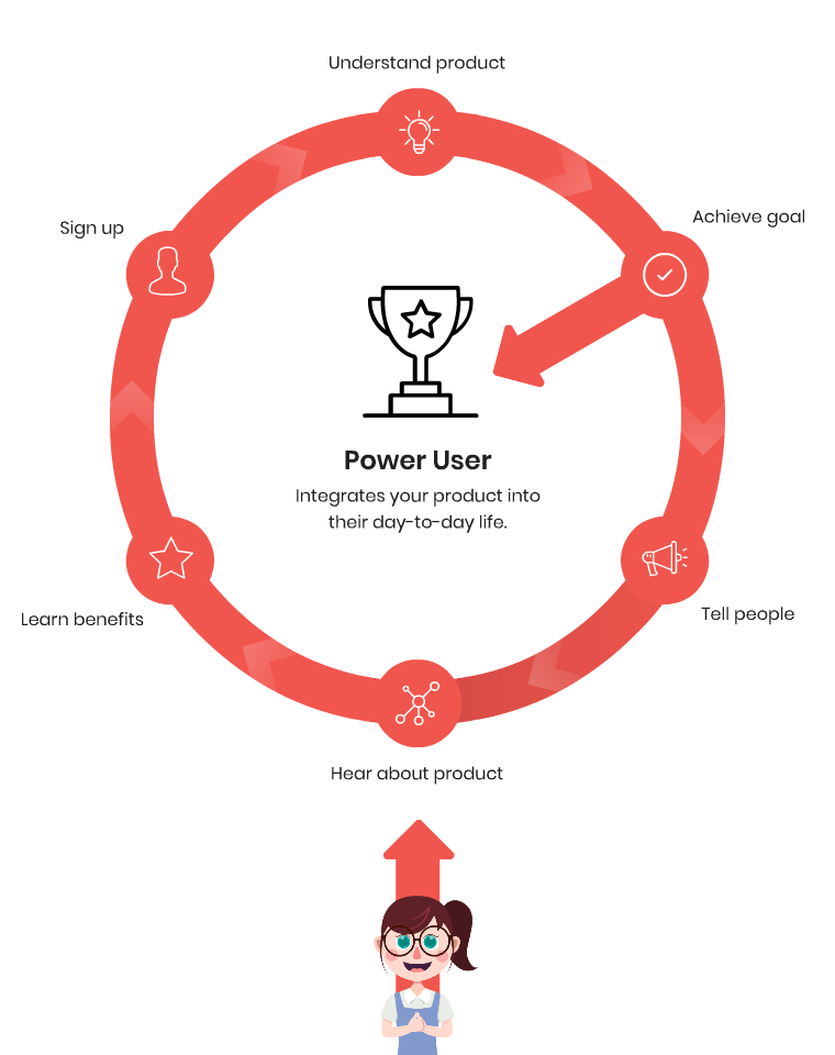
Onboarding tactics that don’t work
We’ve seen many bad approaches to onboarding over the years. Some bad methods are used so often they’re seen as the ‘correct’ way to onboard. But trendy doesn’t mean effective!
Here are a few methods you may have come across before (and why they’re not the best idea).
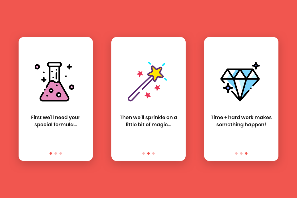
Carousel cards
Carousels have been proven as ineffective. More than once. In fact, many times.
Carousel cards don’t reflect how your product actually works (unless your entire product is a slideshow). They immediately create an impression that your product is going to be hard to use, hence the need for lengthy explanations.
Although they’re pretty, carousel cards don’t actually achieve anything and are often used as an extra layer of marketing. The user is already inside your product – so why keep telling them what it can do rather than showing them?
The exception to not using onboarding cards is Monzo, a banking app. Because it’s too risky to let users jump right in, onboarding cards are used to take the user through important processes. Monzo is an incredibly niche product type though, and most apps don’t warrant this level of caution.
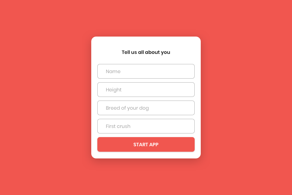
Untrustworthy forms
If your onboarding process begins with users filling in a form with personal details, make sure every piece of information is necessary.
Explain how you intend to help users with this information. Do you need to know their political views and favourite movies right now? Probably not. Only request the bare minimum you need for your product to work.
If you’re going to request information, do it all at the same time. There’s little more annoying than getting through one form and then being hit by more forms halfway through using the product. If you can use the features of your product to collect additional information, then great.
DuoLingo, a languages app, uses word games to help users fill in a form – onboarding them without it feeling like a chore. Users get to begin using the product at the very earliest stage.
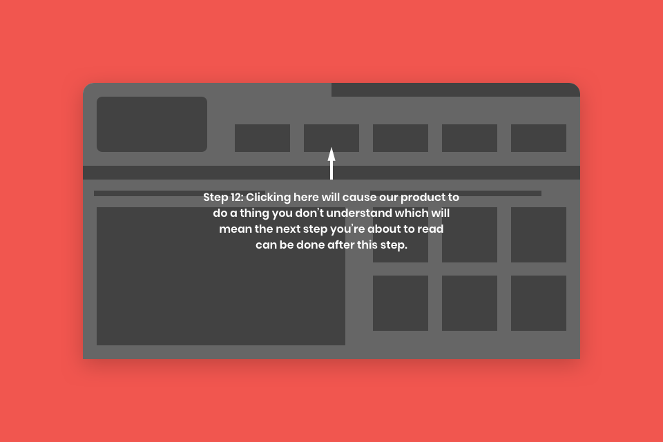
Overlay tutorials
Imagine placing Christmas presents on top of the tree instead of beneath it. What would the kids do? Try and climb the tree? Throw things to knock them off? Cry?
Placing overlay tutorials on your product has the same effect. Users can see what they want and they know they’re going to get it, but they want it right now and you’re putting obstacles in the way. It’s incredibly frustrating. The user is likely to ignore the instructions and dismiss useful information in pursuit of what they want.
At the end of it all, nobody has learned anything. Now your user can access the product – but doesn’t have a clue how to use it. And there’s no guarantee they’ll stick around to learn.
We don’t have any examples to give because overlay tutorials are almost never a good idea! Can you think of any?

Instruction manuals
George Fan gave a great speech at the Game Developers Conference in 2012 titled ‘How I got my mom to play through Plants vs Zombies’. It’s all about the onboarding process of the most popular mobile game (at the time).
There are a lot of great techniques explained in there, but the overall message is that people don’t want to read, they want to do. So refine your journeys, simplify your UI and let the users… use. Put them in the real environment and let them try your product out.
If text instructions are genuinely the best way to train your users, consider how they can integrate into your product as an experiential manual. Slack does this excellently by placing users in a conversation with their Slack Bot, who gives them a guided tour.
Tooltip tours
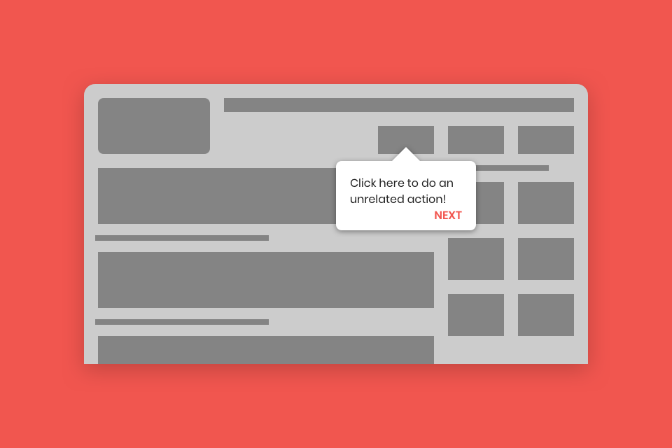
They seem light and friendly. Unobtrusive. Flexible. The right level of ‘learn if you want, use if you’re ready’. But in reality tooltip tours are controlling and distracting.
They’re lazy design. Tooltips show that you forgot about looking after your new users and slapped together some help as an afterthought. They have a painful habit of popping up when users are trying to do one thing and pointing out another thing, splitting their focus from their goal or overloading them with information. Often they’ll block the entire product until the user reads them. You know a tour is truly pointless when it contains a ‘skip’ button.
If short text snippets dotted around your product really are the best way for users to learn, make them interactive and flexible. A great example of this is Trello, which makes the tooltips part of the product with a sample board for users to work through.
Prepare for nothing
The best onboarding journeys occur without the user knowing they’re being onboarded.
Preparing empty states that naturally guide users to take action are a good way to covertly onboard users. Rather than being shown or told to do something, a user takes their own initiative to explore and become integrated into your product.
Examples of this include Google Docs and Dropbox. When there aren’t any files saved there are limited actions you can take, so the onboarding process kicks in to both explain what to do and help you create your first file.
The ‘wow’ moment
Onboarding isn’t over when a user has handed over personal information. Or when they’ve been told where everything is.
The best onboarding flows finish with user success – when a user has achieved the aim they signed up for and reached their ‘wow’ moment.
If users can complete their primary goal and it enriches their life as your marketing claimed, you’ll have one more happy, committed user. Onboard them in a gentle, useful and enjoyable way and watch as they recommend your product to others!
We’re currently creating a new onboarding flow for Shiken, a medical revision platform. Our onboarding process stretches deep into how the product works for the end user. Explore our portfolio to discover how we’ve helped other organisations reach their goals.