A new project arrives. Sketch is open and you’re creating the pages you think you’ll need. This isn’t your first rodeo; you’re even setting up Artboards in preparation. Despite your prep, every project ends with a mess of renamed pages and a boatload of Artboards for adjustments. Don’t worry – you’re not alone!
After learning the process which Cookies uses to tackle speeding up the design process, I’ve managed to simplify it to make the work load feel so much lighter.
Simplifying your process not only saves you time, but it saves the client money.
I’ve just handed over a piece of work for one of our clients and it genuinely DIDN’T happen in a mess of disorganisation. A simple setup system beforehand (after multiple attempts on previous projects), allowed me to keep things organised. Each page I worked on was pre-planned, with everything organised to de-clutter the project and speed up the design process. So how do you approach your project, how do you keep a Sketch file in-check? Let me share how:
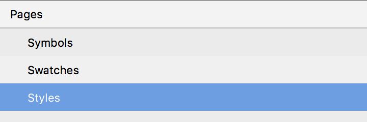
Element Pages
New pages crop up throughout the design process. As new elements come into play, there’s no avoiding the additional features, sections and content that arise whilst working on a project. If there are three pages you know will exist throughout, you could set up the following:
- Symbols: don’t bother cleaning it up, it will always be a mess. As long as it’s there, all your elements have a place to live.
- Swatches: full of 100×100 artboards containing a single colour, that can be used throughout the project to adjust individual element colours (I’ll explain this Sketch-colour workaround in a future post).
- Styles: handing over to clients and developers requires style guides. Style your text and elements early and stick to your own rules!
Artboards
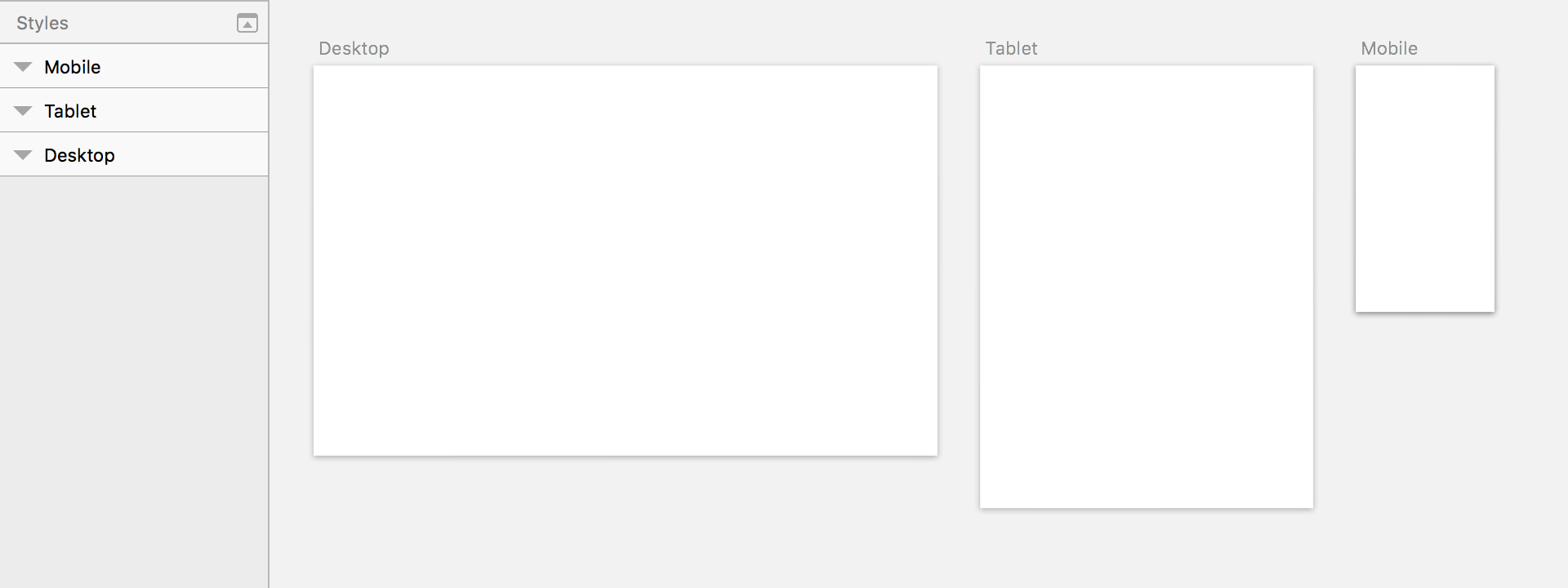
Ignoring Sketch’s pre-made Artboards because they’re not the same dimensions as specific devices themselves was a stupid decision on my part. Understanding how mobile operating systems scale things changed my entire approach to cross-platform design in Sketch and it’s important to just trust that these odd dimensions make sense. For each new page I create, I will immediately add Artboards for:
- Desktop HD (1440w)
- Tablet (768w)
- Mobile (320w)
These are all under Sketch’s Responsive Web dropdown. If you’re designing for iOS only I would highly recommend using the built-in Artboards for Apple Devices.
Layouts
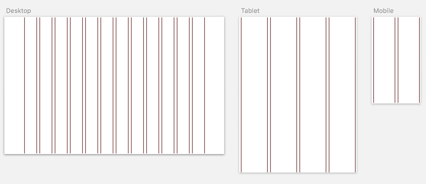
Different projects don’t require different grid layouts. It’s tough to convince people to reuse the same columns and layouts on projects that differ entirely, but there’s a few small rules that I always apply regardless of the project and they’re holding up pretty well! It’s important to note I NEVER use “rows” and am yet to speak to anybody else that does.
- Desktop: 1200px width, centered, 12 columns, gutter on outside, 20px gutter width, 80px column width
- Tablet: 768px width, centered, 4 columns, gutter on outside, 20px gutter width, 172px column width
- Mobile: 320px width, centered, 2 columns, gutter on outside, 20px gutter width, 140px column width
Ready to go
You’ve got questions. You’ve got reasons you don’t think this will work with your project. You’re skeptical and we understand! Our advice is to just try this setup method for yourself. For me, it works. If it doesn’t work for you, what is your preferred setup? Finding what works for you is what can get your creative juices flowing. Experiment and find what feels most comfortable for you, whatever allows your process to flow freely. Remember, time is money!
Header Image by Joe Willmott


