For the latest Smart Cookies Breakfast Club, Romaric Pascal (Tech Lead here at CookiesHQ) shared his top tips on digital accessibility and how to involve the whole team in the process.
Technical products permeate nearly every area of our lives, and even more so so during a pandemic.
While tech has the power to open up communities and link individuals to modern society, some tech products can also leave people feeling isolated and left behind.
We traditionally think of accessibility as an issue for developers and designers, but this shouldn’t be the case.
Romaric offers an overview of what accessibility means for web development and how it involves the whole team – from developers to stakeholders, through project managers, designers, content creators, marketer and testers…
He gives specific examples of what to look for in each of those domains to help start improving your site or app accessibility right away.
You can watch the replay below or read on for a summary. You can view Romaric’s slides with links here.
A web in a sad state
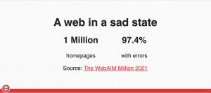
In the top 1 million homepages, 97.4% of them have automatically identifiable errors.
And these are just the ones that you can automatically identify! This doesn’t account for any that you can’t detect automatically. On top of that, the way we design and build content on our websites introduces more barriers. We consulted UX flows that confuse people or put distracting elements or animations next to text users are trying to read. Often audio or video files are not accompanied by captions or transcripts.
All of this excludes people and essentially sends the message that “We don’t care about your needs”. We don’t care about users getting our content or getting involved with our business. Internally, it tells people we don’t care about hiring people with your needs. It excludes people, and we can all agree that excluding people is, well, pretty crap.
It’s not just crap; it’s discriminatory!
In building the web the way we do, we exclude many people with disabilities that won’t necessarily be using a screen and a mouse to browse the web. Unfortunately, in today’s fast-paced business world, building an accessible web simply because it’s the right thing to do doesn’t always cut it. It is usually reason enough for socially-minded organisations, but some businesses need further persuading.
Increasing accessibility is going to help everyone and encourage more people to use your website. A recent government survey found that 22% of the UK population say they have a disability. Not all will be impaired when it comes to browsing the web – but it’s also important to factor in people with temporary disabilities, such as recovering from an eye operation or browsing on a shaky train.
Additionally, there are legal requirements in the UK (through the Equality Act from 2010) and worldwide to make your site accessible to those with disabilities.
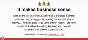
Caring about accessibility means more business for you – the people whose needs are catered for will visit and use your website. They won’t go to a competitor if they cannot use a competitor’s site – as illustrated in this customer tweet to Hello Fresh UK.
There’s no silver bullet.
There’s been a rise in AI solutions that detect what’s on the screen and sell you magic accessibility compliance. Unfortunately, the AI isn’t quite up to speed yet and not only are they not-so-magic, but in some cases can further impair a website’s accessibility.
And so all of this makes a case for not treating accessibility as an extra add on, but something that is built into the product from its very foundations and owned by everyone in the process. Developers need the support of Project Managers and Sales teams to ensure that accessibility is factored in.
The aim isn’t to sell accessibility as a bonus but to defend accessible products as a baseline. We shouldn’t take away from accessibility to cut corners, make things cheaper or ship them faster. It should be a part of your features which means developers need to gather requirements together, recall bugs against those features and prioritise those bugs properly.
For this, there needs to be an in-depth understanding of the requirements for accessibility and what constitutes an accessible site.
Figuring out what to do.
The best way to find out what disabled users need from your site is to involve them in your process. They will know the barriers they face when browsing, which is important as developers usually browse the web in a very different way and need to learn about using a screen reader or only browsing via keyboard.
If you’re developing a new UX pattern or going through innovating for disabilities, it’s so important to involve disabled users and make sure that what you’re innovating doesn’t actually impair them further. And, because they will be bringing their time and expertise to the table, it’s important to compensate people fairly.
Then, you can look at following best practices. The Web content Accessibility Guidelines are a set of 80 criteria to help you measure your website accessibility. There are three levels from which you can build upon – and the criteria are referenced in many legislations, with the second level seen as a baseline for what makes a public website accessible.
These guidelines affect the whole scope of building the product.
Design
There’s the design side, where you want to make sure your layout is structured and consistent so people can understand it clearly and are not thrown off when navigating from one page to another. Sizing and spacing are critical for the text to be readable and for controls like buttons and form fields so people can interact with them.
Responsiveness also comes into it. Responsiveness in many minds means optimising for mobile, but those mobile layouts will appear for people browsing with high zoom on desktop. This means that your mobile site should offer the same functionality as your desktop site. Perhaps through slightly different paths, but people should be able to do the same things.
Appearance
The fonts we choose will also affect the accessibility of our site and can help or hinder people in reading what’s on the page. Going that extra step to highlight important information by putting a graphic next to it and highlighting it in a different colour can further help people understand your content.
Finally, there has to be enough contrast for elements to be seen on the screen. Contrasted doesn’t mean boring, though! It doesn’t mean black against white or other dull colours. You can be very bold and choose elements like a bright blue background with bright pink and white content.
Interactions
Our websites are not static. We build them to go from one page to another and for people to interact with them. We are quick to think about mouse navigation – hovering over elements dragging and dropping or gestures such as swiping and pinch-zooming.
But, it pays to think of those interactions as keyboard first. It is not necessarily the fastest way, and not all interactions will flow like that, but keyboard first should be your baseline.
We also need to be mindful of automatic changes such as flashing a popup on the screen of people while trying to do something or making messages disappear too quickly so that people can’t read them. Use caution with animations so as not to distract people or make them sick,/cause seizures.
Content
One thing we don’t necessarily think about when it comes to accessibility is the content in your site – making sure it’s structured and broken down properly so that people can comprehend it more easily.
Making sure the labels of links, buttons, and controls are meaningful, especially links – ‘click here’ links or ‘this page links’ are not helping anybody. And when it comes to the vocabulary, paying a bit of attention to not excluding disabled people further through ableist language. To not exclude people by putting plenty of technical jargon in the text or writing with a much higher reading age than the intended audience has.
Media alternatives
There’s also a lot of forgotten content we should put on our websites – media alternatives. Images or graphs aren’t necessarily the best way for everyone to consume content, so a textual description is necessary. Having transcripts next to audio and video so that people can read along instead of listening.
Context is crucial here – especially for images. This is why it will be tough for AI to get there in terms of accessibility truly.
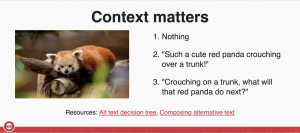
Take this picture of a red panda – there are many ways it can be captioned depending on what page it’s going to sit on. Maybe there’s enough information on the side that it’s fine to leave the alt text empty – if there’s enough content on the side that the image is decorative, that’s your first option. Maybe you’re writing an article about seven animals that are going to lift your day, and you can caption it ‘such a cute red panda crouching over a trunk,’ preferably describing why it’s so cute. But maybe you’re writing a story about that panda, and it’s illustrating a part of that story. And in that case, you might want to express that the panda is crouching on the trunk. What will it do next?
Development
The basis of development is to provide proper semantics. The key is to make sure that the content is visible on screen and reach assistive technology like screen readers.
It starts with strong use of HTML and ARIA, HTML elements, their attributes properly and ARIA extra attributes that add more semantics to the HTML. Ensuring pages have proper headings and landmarks helps people skim the page via assistive technology the way a sighted user would. Finally, making sure that all elements are labelled, have names and their state is conveyed.
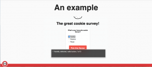
In practice, if we take this example of a survey asking, “what’s your favourite cookie flavour?”. The options are Nutella, Coconut and Pecan as radio buttons. The focus at the moment, where the user is when they navigate through the screen reader and keyboard, is on the first answer Nutella, which is selected. And all those semantics and labelling enable a screen reader to tell users that the focus is on the radio button at the moment.
That’s the semantics part, choosing the right element in the HTML. The name of the option is Nutella. So that’s the part about labelling, ensuring that things are named and that that option is selecting, conveying the right states. And again, those semantics around the radio button also let people know that it’s one of three radio buttons, and they don’t have a massive list to go through.
Adaptability
So we’ve got content nicely marked up in the HTML, and we need to implement the design. And the first thing to do is to make sure the design is adaptable to screen sizes. Keep in mind that people will zoom to the orientation of their device because not everybody will be able to tilt their phone or their tablets. It adapts to different font sizes and line heads because some people have different settings in their browser to help reading. And making sure it adapts to high contrast to reduce motion to dark mode—all sorts of preferences that people can set in their browsers because it helps them browse the web.
Another key thing when it comes to styling the content is making sure that the elements are reachable the way they should be so that keyboards and assistive technology can reach anything on the screen.
And, perhaps more importantly, that those technologies cannot reach the things that are not on the screen (or maybe slightly obscured by an overlay behind a module). And finally making sure that when you reach those elements through a keyboard or assistive technology, things flow in the right order. So if you’re in a top left to bottom right language like English, you follow those directions when you tap through the page or focus through the page.
Interactions
So when it comes to the building part, we need to pay attention to interactions. The focus to start with is the indicator of where people are on the page. Making sure that it’s visible, so they know where they are on the page – that we don’t lock them in a part of the page. And that’s we pay attention to where it is before making sure that the elements that are going to start an interaction can be focused.
We need to be mindful of activation – like how interactions get started. ONce you have the focus on the elements, which keys are going to trigger the interaction? A quick example is pressing space on the button. That’s something that’s expected when someone knows they’re on the button. If that doesn’t work, that’s a barrier you put in that way when they browse the website.
And finally, interactions usually have some feedback on it. Especially if they’re long, you’re going to have some loading, maybe they’re going to succeed or error. And this needs not only to be shown on the screen but also convey to assistive technologies. And also, when it’s built, things need to be tested. And again, the best way to know if it works for disabled users is to ask them because they know best the barriers. But actually, they should be the last ones to test because their role should be to give us bugs that only they can identify. After all, they’re highly competent in the way they browse the web.
Testing
Anything that we can pick up beforehand should be picked up beforehand through manual testing. So that’s quite a list there in order of what I’d say the easiest to do, the most cumbersome to do. Checking that headings and landmarks are like there and relevant and in the right order make sense. Checking colour contrasts, making sure that the colours are contrasted ideally enough at the design stage, not at the testing stage at the end. Quickly navigating through the keyboard, tapping through the screen. If you can see where you are if you don’t get logged, you can activate the things properly. Opening up a screen-reader and seeing how things are read. What’s appearing in the shortcut menus regarding headings, landmarks and all the other shortcuts people use for browsing with those devices.
And finally, going through the whole web content accessibility guidelines checklists on the main pages of your sites, obviously a much bigger step to take. There’s a bit of automation that can be done there with a bit of a caveat, though. It’s not going to catch all the arrows, so depending on the tool you’re going to be using, you’re going to have between 13% and 40% of errors. The U.K. Government, the GDS team conducted a review of different technologies and how many errors they were able to find out.
And all those errors need a bit of human review. There’s going to be a few false positives; there’s going to be a few false negatives. Some errors can be caught. But it’s not a replacement for humans. It’s accelerating human testing. And finally, accessibility extends beyond your websites. You’ll likely have some social media presence, posting images, make sure you label them with alternative texts and use proper capitalisation in hashtags so that people can read them.
If you provide apps or documents, making sure that those are accessible too, both can be made accessible generally. And even offline, whether it’s your premises, the product you build, think about accessibility. It’s obviously a different set of requirements than on the web, but the accessibility doesn’t stop at your website.
So, where do we go from there?
Firstly, to get started, you don’t need to overhaul your company. If you’re a designer on the next design you do, you pay a bit more attention to contrast, and accessibility wins. If you’re a copywriter on the next piece of content you write, you make sure that your links are meaningful, and that’s a win again. As a developer, you pay attention to the labelling of your buttons on the next site you build. As a tester, you start looking into those accessibility features and start putting up bugs.
This can feel overwhelming. There’s admittedly a lot to go through. You don’t want to think, “Right, tomorrow I’m going to be 100% accessible” because it’s a massive jump, and it’s too big a step to take. And also, because given the spectrum of the way people access the web, it’s a very, very high bar to reach.
But what you can do, is trying to factor in accessibility more than you did yesterday. And then tomorrow you try to do better than that, and the day after, you do even better. It’s going to snowball, and accessibility is going to improve. As we’ve seen, there’s a lot of work for everybody, so best to involve everyone. If it’s a concerted effort, it’s going to yield bigger gains than if it’s not.
We’re the ones building the web, we’re the ones making the products, and it’s our responsibility not to exclude people.
A big thank you to Romaric for such a great session – you can find out more about what he’s up to by following him on Twitter or connect with him on LinkedIn.
Why not join us at our next Smart Cookies Breakfast Club session? Bitesize chunks of top quality content to help you take your business to the next level, all before 9 am!