We build products for the web, which means users have many different options for ways to interact with the sites we make – they will run on various browsers and a wide range of machines. Services like Browserstack give access to a wide range of browsers for testing, but they come at a price. Not just in terms of money: if your internet connection unreliable, testing becomes sluggish.
With a bit of preparation, you can test a wide range of scenarios right from your machine. Running things locally also means you can install a range of extra tools for checking the sites’ accessibility. Let’s dive into what I’ve set up on mine.
Browsers
Safari comes bundled with Mac OS. But that’s only one browser. Some people will use Chrome, others Firefox or Edge. Modern browsers behave more similarly to one another than in the past, but it’s still necessary to give a check to be on the safe side.
- Install Chrome
- Install Firefox (and allow it to zoom a bit further than it can by default to help accessibility testing)
- Install Edge
While setting up browsers, it can also be handy to set up your Mac to show scrollbars instead of hiding them by default (a tip I took from Florens Verschelde’s experience). It’ll help you spot when you’ve got unexpected overflowing content more easily. The setting is in your Mac’s System Preferences, under General, through the Show scroll bars options.
Apple is nowhere near in the lead when it comes to the OS people are on when browsing the web. macOS, even less so, with a lot of people browsing on phones or tablets. This means those browsers will only match a small percentage of the sites’ audience. Some might provide ways to emulate touch interactions like on a phone or tablet or even reduced computing power. It’s not enough to replicate Android, Windows or iOS’s browsers behaviour, however.
Non-Mac desktop browsers
Virtual machines help for testing other desktop platforms. VirtualBox offers a free way to run virtual machines. Microsoft provides virtual machines for each of its browsers, allowing you to test Edge, IE11 (and even older versions if your audience requires it).
It’s a bit of a bulky solution but gets you an environment for testing Windows browsers without relying on a stable internet connection. And you can, of course, create Linux VMs to test browsers in that OS if necessary.
Android Browsers
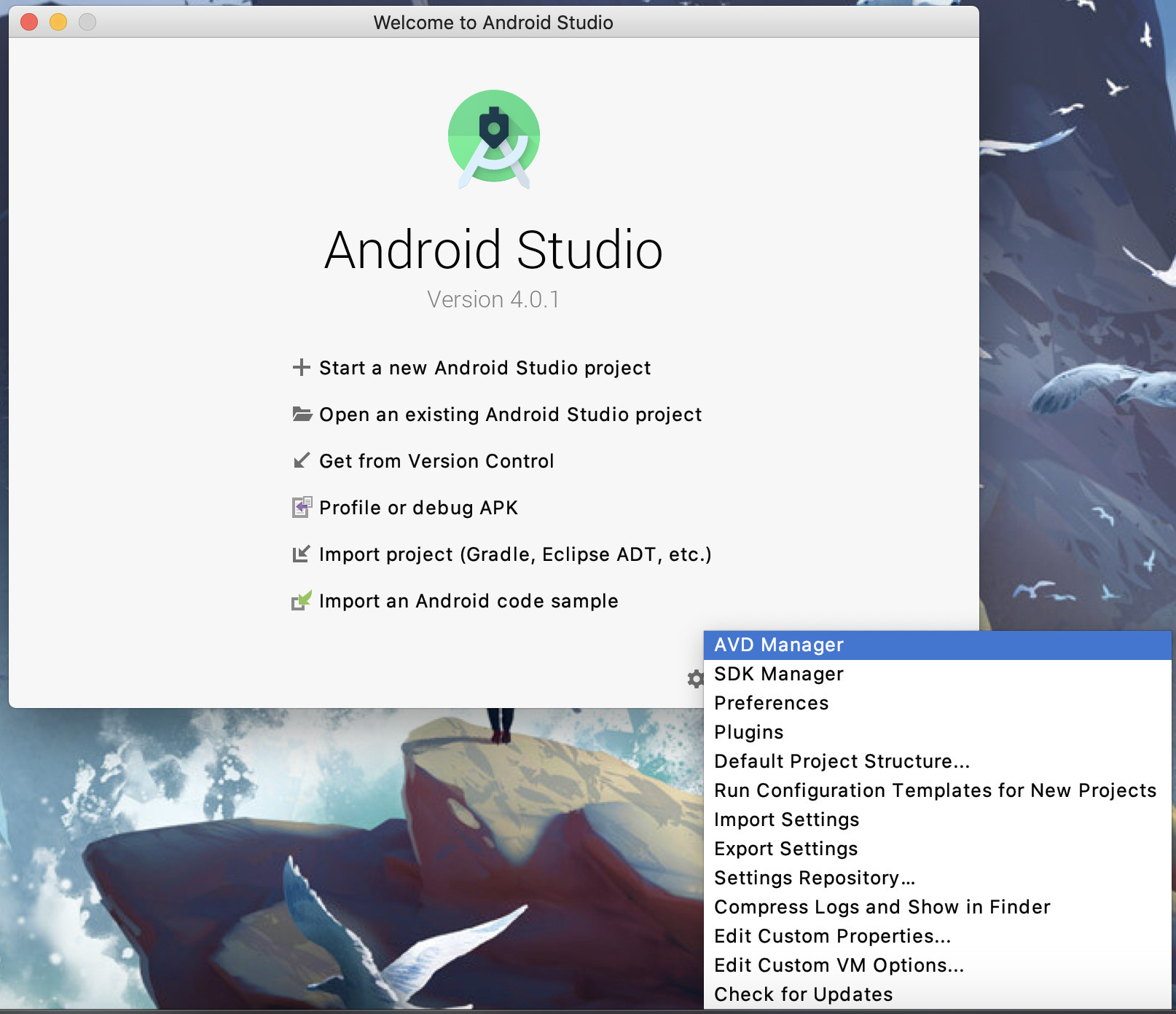
For Android, Android Studio provides emulators to run Chrome (and maybe even other browsers as the Play Store seems available on some versions). Without launching the full Studio for development (which is admittedly quite heavy for browser testing), you can run the Virtual Device manager through Configure > AVD Manager in the bottom right corner of the start screen. It’ll let you create devices with specific Android versions, screen size and capabilities to match your audience (or the particular device a bug got reported for).

iOS Browsers
Similarly to Android, you can run Safari inside the iOS Simulator to test things in iOS browsers. Being a simulator, not an emulator, it’s not 100% like running it on an iPhone or an iPad, as far as I understand. It proved good enough to hunt bugs though.
The simulator comes inside XCode, which you’ll have to install from the App Store. Inside, you can install the various iOS simulators from the Preferences > Components menu. Once the ones you need are installed, I’d advise adding the simulator to your dock after running it the first time from the XCode > Open Developer tools > Simulator menu. This way, no need to launch the whole XCode every time you need to test.
Inside the Simulator itself, you can pick the devices you want to run under File > Open Simulator > <IOS_VERSION> > Device. Safari should appear at the bottom of the menu, and you’re good to test!
Accessibility testing tools
Browsers are only part of the equation when it comes to testing front-end work. It’s crucial to ensure the sites we produce can be browsed and interacted with using whatever method the users need. There are a few more things to set up to help with testing on that side.
Keyboard navigation
Not everyone will use a mouse or touch to navigate, so it’s crucial that our sites respond appropriately to keyboards too. Mainly this requires checking that interactive elements can be reached with presses of the Tab key, in the appropriate order, with visual feedback and without disappearing out of the screen or getting trapped in a specific area.
By default, macOS won’t have Tab presses target all focusable elements. There’s a bit of setup to do here, both at the system level and in Safari and Firefox’s preference panels. This article details the couple of steps to get your Tab key stop on each focusable elements.
Screen reader
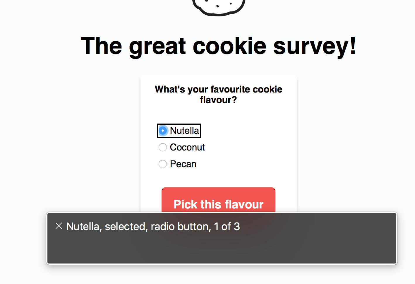
Equally, not everybody will look at a screen – or more specifically, read what’s on the screen. macOS bundles in a screen reader called VoiceOver that’ll read out the content of the pages. Best used with Safari (though Chrome and Firefox are working on improving their support), it’ll let you check that the content is properly exposed to assistive technologies. Especially making sure that the list of shortcuts (links, landmarks, headings…) are filled properly and without ambiguity, and checking that hidden content properly disappears (or conversely, that content that should only appear for assistive technology does indeed show).

VoiceOver can be started/stopped with Command + F5 (or three presses on the power key for keyboards with a touch bar). Control + Option + U will give you access to VoiceOver’s rotor, with lists of shortcuts you can cycle through with the arrow keys (Left/Right to change the type of shortcut and Up/Down to pick in the list). Control + Option + Arrows will help you navigate through the content once inside the page with Control + Option + Shift + Down or Tab through the focusable elements. To go further, Deque has put up a useful list of VoiceOver shortcuts.
Heading levels & landmarks
Headings and landmarks structure the page and help users navigate quicker. The pages headings form a tree based on their levels: level 2 headings nested inside level 1 ones, level 3 inside level 2… Going through headings, especially, is the method that respondents of the 2019 WebAIM Screen Reader User Survey prefer. Landmarks define main areas of the page to which users can quickly jump: navigation, main content, footer… They allow users to jump past large blocks of the page to reach the one they’re after. They might show visually through the design but must also be communicated in code.
Two browser extensions allow to verify landmarks and headings:
- The Landmarks browser extension, for both Chrome & Firefox, will reveal all the landmarks on the page (and let you jump to them). It’ll let you check if the right landmarks are there (at the very least a
mainone, usually a primarynavigationtoo). - The headingsMap browser extension, for Chrome or headingsMap browser extension, for Firefox) will show the tree of headings and let you verify that they’re in the right order: without skipping levels (no level 4 under a level 2) or wrong nesting (a heading that should be level 2 but shows as level 3, for example, will confuse users because it’ll appear as a child of the preceding level 2).
General accessibility tests
Last, a few extensions generate reports about common accessibility issues on your page, and it’s good to have at least one installed. Lighthouse comes bundled into Chrome, but aXe or WebHint do a good job highlighting such issues too. They won’t save you from doing some manual testing, as they can only show errors that can be automatically detected. The time they save showing up those mean you can spend more time hunting the ones that a computer can’t find on its own.
That makes it quite a long list! Getting those tools set up early means they’ll be there when you think of reaching out for them. No friction of having to install them at that time or being slowed down by a flaky internet connection. In turn, this means a big win for the users, as the app gets tested more widely early on, reducing the likelihood they encounter bugs once it’s in production.